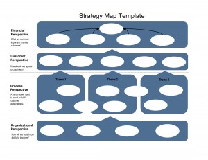
It’s been a while since I’ve posted a template. I’m in the process of helping the Organization Change Alliance with their strategy map, so I thought I would post the generic template we started with.
A strategy map is a one-page visual representation of an organization’s strategy. It originates from the Balanced Scorecard methodology, so it consists of the four BSC perspectives: Financial, Customer, Process, and Learning/Growth. The “bubbles” are placeholders for objectives – individual pieces of the strategy, like “Maximize marketing effectiveness” or “Create enthusiastic customers.” The objectives answer what success looks like from each perspective. Themes, usually in the Process perspective, are groups of objectives with the same general, well, theme.
The template is in PowerPoint format. Feel free to modify as you wish, and contact me if you would like some help.
If you found this post useful, you may also be interested in:

Thanks for this great template. It is surely a very good visual representation of the change strategy and can serve as a great communication tool too. I noticed that the bubbles in the “Process Perspective” layer overlap different themes. Does that mean that different process improvement initiatives can contribute together towards the Customer Perspective layer?
The themes are groups of objectives – since there are usually many in the Process Perspective, it helps to group them. The themes also add another layer of clarification of what is important to the organization.
Since the themes are categories, often you will see some objectives (bubbles) that overlap themes. For example, let’s say you have an Innovation Theme and an Operational Excellence theme. If you have an objective called Improve Innovation Process, then that objective would overlap the two themes.
The objectives in the Process Perspective can – and in fact should – contribute to either the Customer Perspective or the Financial Perspective. One of the most informative pieces of the strategy map is how the objectives are linked in cause-and-effect relationships. In the template I have general arrows between perspectives, but I have frequently seen maps that have direct lines showing the cause-and-effect between individual objectives. In combination with a good scorecard and a lot of data, some companies even do in-depth analysis to prove/disprove these linkages, essentially testing the logic of their strategy.
Thank you for the question. If you would like more detail, I would be happy to connect.